

Having just released two new 3D die-cut cards by Matt Johnson, we took the opportunity to learn more about the artist behind the work. From his life in Cornwall to his creative process, Matt shares the influences and ideas that shape his distinctive illustrations.

How long have you been based in Cornwall, and what took you there?
My partner, Kathryn, settled here after studying at the Falmouth School of Art. I moved to Cornwall in 2004 to be with her. As a blow-in, I’ll never be Cornish, but it is my home now, and I have felt incredibly welcomed and included in the local community.
Who or what are your biggest creative influences?
British art and design from the mid-20th century has had a big influence on me. Some of the landscapes from that period have a great mix of prettiness with more moody elements, like rough textures, jagged rocks and twisted branches. I think there was a lot of stuff like that still around when I was little, in print and in public spaces, and it sank in. It has been lovely to see it come back into fashion a bit in recent years.
Can you tell us a little bit about your creative process when creating a new image?
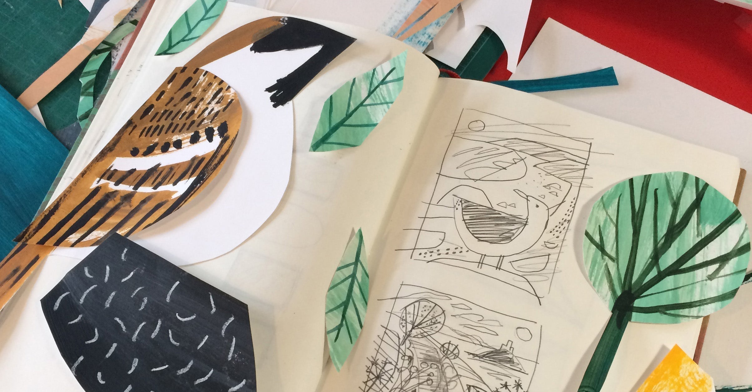
I start by sketching on location. I go for a walk and make drawings and notes of what I see. I find sitting and drawing forces me to stop and really look at things properly, which I find super valuable, even if the finished sketch isn’t brilliant. My pieces always show the birds, animals and plants I saw, in the place I saw them.
When I get back home to my studio, I’ll make a thumbnail sketch in pencil to work out the composition. I find working small helps to create a more lively and pleasing layout. This is often the hardest part and involves a lot of rubbing out and redrawing. When it’s done, I scan it and drop it into Adobe Illustrator.
Before going any further, I stop and pick a colour scheme. I’ll try and make it quite limited - maybe a warm colour, a cool colour, a mid tone, black and white. Having this limitation forces me to get creative and stylise things. For example, if there’s no green, what colour will the grass be? It also means I don’t get distracted with colour choices while I’m working.
I use the pen tool in Illustrator to block out all the main shapes and areas of colour. I normally get a feel for how well the illustration is going to work at this point.
Next comes the serious drawing! I draw all the details and textures on paper in black ink, pencil and paint. At the end, I’ll have ten or twenty scribbly sheets. These all get scanned, dropped into Illustrator and vectorised. I move all the various bits into place and colour them. I like using the pathfinder tools in Illustrator to crop some of the messy marks and textures inside neater shapes.
It’s not a very quick process, but I like the effect it gives. It also allows me to do all the drawing on paper but edit digitally, which is great, as I hate drawing on screen, but appreciate being able to rearrange and tweak things.

We know music is important to you. Does it play a part in the work you create?
I am obsessed with music, and it's normally distracting me from work, but it has also been weirdly helpful to my art career over the years.
In my teens and early twenties, I made lots of flyers and posters for my own and friends' bands. It was my first proper go at doing graphics and illustrations that were put to use and seen by an audience. They started out with pens, Letraset and photocopies, but eventually I bought a laptop and printer. After art school, I got a job in a repro studio that did music packaging. It wasn’t a creative role, but was a tiny toehold in the creative industries and gave me a bit of technical knowledge about design and printing.
Early on, the DIY punk movement inspired me to want to publish and sell my own work. However, I didn’t have the skills or confidence to start my own business. It was only after working as an employee for many years that I slowly gained the experience I needed to breakaway. The idea of DIY made me lean into my own business rather than freelance commissions, and that has been really useful in the last few years and allowed me to be more independent.

Can you tell us a little bit about the sleeve you created for the ‘Sounds of Rewilding’ project?
It came about through a good friend who I used to work with at the repro studio. I jumped at the chance to do it when I heard it was for Knepp Estate and was a birdsong vinyl LP (I have a small collection of birdsong LPs at home). The project was unpaid, which can be frowned upon, but I do like to do unpaid things very occasionally, if they are something worthwhile, and it means I have total freedom in what I produce. The record label gave me a list of the species they wanted me to focus on, like turtle doves and Purple Emperor butterflies, but otherwise I had free rein in the design and illustration. The combination of hand-drawn marks and bold flat areas of colour is inspired by my favourite 1950s jazz covers by David Stone Martin.
What’s next for you creatively — any upcoming projects or directions you’re excited about?
I have just started some seabird illustrations that I’m very excited about. I’ve been out sketching some of the marine species that visit during the winter, like red-breasted mergansers and great northern divers. When spring arrives, I will take some boat trips and hopefully see some puffins, guillemots and shearwaters.
Explore our range of paper goods by Matt Johnson
Follow Matt Johnson on Instagram


